The Rebrand
Transitioning from the old to the new
October 2021


Whilst we are here let’s mention the fact that we transitioned from being a sole trader into a company. We are up there with the big dogs. There were many things to consider in making this decision and perhaps that’s another blog on it’s own. I felt that for growth in our design services we needed to act as a company rather than little ol me working from home. Plus it pushes me to move into another level of business, a place out of my comfort zone and to be and think bigger. Before I get carried away on this kaupapa, let's get back to the rebrand.
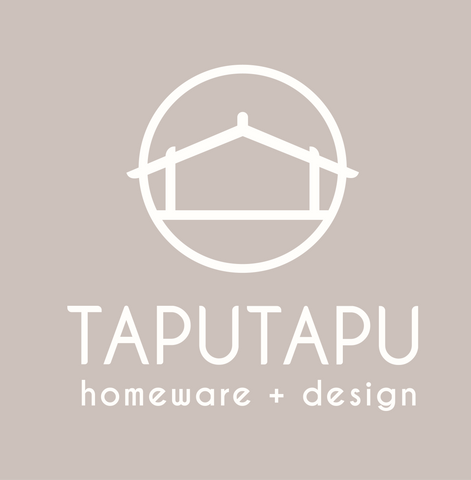
Our new logo was a hybrid from our original logo. We decided to keep the continuity between logos. The whare for me represents our mission of getting Te Reo Māori into homes- it’s that simple. The font is designed to have soft curves, touches that represent whakairo. We likened this logo to be soft, simple and yet Māori. The vibe we want to achieve with this brand is homely, earthy, professional and modern Māori.
I looooovvveeed the change. The new soft brown pink colours were refreshing and reflected the new direction of considering our taiao and making our own products. There was something about adding colour that gave a vibrancy to our business. It was a good call!
I changed our profile photo on instagram and facebook with our new logo and it felt weird because it hadn’t been changed since day one of Taputapu. We received good feedback from our followers about the confirmed new logo too so it was smooth sailing from there.
The important thing I did before the rebrand was making sure that our followers were with us on the journey. We asked them what logo concept to go with and we shared about the direction we were now heading in. So when the new logo hit and the change happened it was an easy transition and our followers were excited with us.
Here are some tips with a rebrand:
- Communication is key with your followers
- Give the new logo and brand a few months to brew
- Three months later evaluate- does it work? What edits do we need to make
Now that we’ve had the new brand for about three months I have noticed some challenges with the logo and realised that the colours didn’t reflect the vibe of our design services. I’m not mad about it, I think the colours work perfectly for our products but not so much for our design services. Coming into this realisation now is great. We are now working on how to change up the colours to represent our design services. More information to follow.